Contrast is everything in photography composition. Right now we’re going through a moment in history that is defined by playing with light. The memorable images are the ones that use contrasting elements to draw the user in, and keep them there. Because photography has become so accessible through applications like Instagram and Google Images, there is more competition now than ever before.

I’ve said it many times before, but I believe this is an amazing transition for photography. More than ever, I’m seeing people of all ages coming out and learning how to take photography from a hobby, to a lifestyle, to a career. This life-long passion of mine has taken me around the world, and I’ve experienced so many amazing sights that I wouldn’t have if it wasn’t for my camera. So helping more people get out there and see the world like I do is an endlessly rewarding venture.
Part of the reason that my photos have stood out, and have won awards is because of how I compose my images to capture the natural contrast in a scene. This article is going to describe the different types of contrast, and how to capture them in camera. For those of you interested in a certain type of contrast, here’s some quick links to the ones we’re going to talk about.
| Light and Dark contrast | Color Contrast | Blur and Sharp Contrast |
This article is part 2 in a series about how to use contrast to make better images. Find the first article on editing for contrast here.
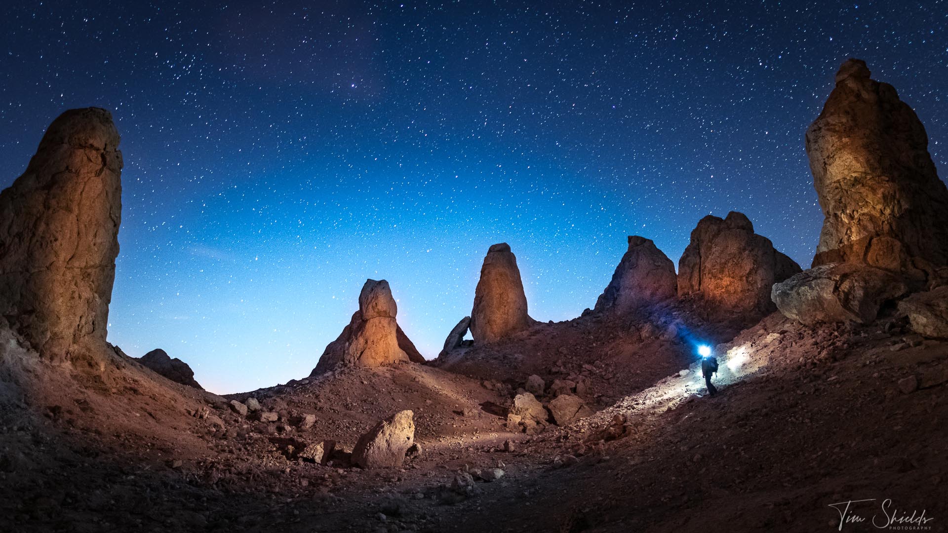
Composing images for Bright and Dark contrast
Have you ever taken a photo that just didn’t feel inspiring? One where you went out to a gorgeous vista, like a beautiful, long beach, or the top of a mountain overlooking lakes and rivers hundreds of miles out. But when you bring the images into Lightroom, they just don’t feel that interesting? This happened to me all the time when I was starting out. Part of the problem is shooting in mid-day sun, when the light is fairly even across a scene. This limits the amount of contrast in a scene and doesn’t draw the viewer’s attention to any one place.
The secret to making these kinds of images look good is to find some shadows to hold the light in place. This is the most common type of contrast that photographers shoot for. Light and Dark contrast is simply using the shadows to direct the viewer’s attention to the brighter object in a scene. There isn’t as much detail in the shadows as there is in a brighter part of an image, and naturally, our brains want to consume as much information as possible. So if you take a photo with deep shadows and detailed highlights, viewers will naturally gravitate to that image. This is one of the natural reasons why photographers edit Vignettes into their photographs. Adding a vignette will draw attention to the centre of the photograph, since there isn’t so much detail available in the corners.
But if you’re finding the shadows are too dark, then take a look at this guide to learn how to brighten the shadows without adding too much noise.
What should I be looking for on the shoot?
Look around the scene for some shadows. It can be from the clouds, dark forests, or the direction of the light. Photographers LOVE sunrise and sunset because they can use the shadows cast by objects in an image to create this light and dark contrast. In the forest, look for beams of light making their way through the trees. Then, expose for the bright parts of the image using spot metering so that the shadowy parts become underexposed. If the shadows aren’t dark enough, you can bring them down with tone curves, or the shadows and blacks sliders in the Basic Editing panel.
Stormy days are another great time to add Light and Dark contrast to your compositions. Just after the storm, the clouds begin to break up sporadically, casting light around the scene. The moody clouds, mixed with some bright spots will make a moody, and dramatic scene unlike any other time of year. Use that light to your advantage!

Composing images for color contrast
This is the hardest type of contrast to achieve, but when you learn how to use color theory to create beautiful images, you’ll never go back. It’s nearly Christmas when I’m writing this article, so everywhere around me are the colors, red, green, blue. These are complementary, contrasting colors, because of where they are on the spectrum. Blue and green blend together really well, and are contrasted by red, which sticks out like a sore thumb. This is a powerful use of contrast. Everywhere you go (at least in North America and Europe), when you see this combination, you’ll know it’s Christmas themed.
One example that doesn’t work is green trees and a blue sky. There’s no additional colors there to draw the viewer in, so unless there is some serious light/dark, or blur/sharp contrast, the image will simply look flat. This is one of the big reasons why photographers shoot at sunset and sunrise. When the chaotic reds, yellows, pinks, and purples fill the sky and cast on the tops of mountains, contrast with the blues and greens along the ground. When you understand color theory, it makes composing and editing for it so simple.
If you have a photograph of a scene that you really like, but can’t seem to make work, try replacing the sky. Photoshop has made this task so easy with their 2021 update. In just minutes, you can take an image from flat to dazzling. And it can be a really strong lesson in how color theory works in landscape photographs. Or, if you want to learn more about color theory, check out color.adobe.com. This resource is perfect for developing color palettes for Photoshop, or other Adobe programs, or just seeing what works.
How to use blur to compose contrasty images
Using blur is a very common kind of contrast to achieve in photography. But it’s the one that has the highest upfront cost. Adding blur to simplify and add contrast to the scene can mean something as simple as photographing in the fog, or as complicated as blurring water in a waterfall.
Let’s start with fog, because it’s the most dependent on location and timing. Planning a trip to capture a foggy scene is impossible, since it’s so weather dependent. Higher elevations, or cities like London and San Francisco do provide more opportunities, but there’s still no guarantee of seeing fog.
But the reason that photographers love fog is because it obscures the background in an image, making your subject one of the few objects that’s sharp. In this case, the fog’s obscurity works like shadows in bright/dark contrast. Since the viewer’s eye can’t make out the details, it is drawn to the parts of the image that have the most information. This type of simplification is so sought out, that people will use fog machines, aerosol sprays, or other post-production methods to mimic it. But just nothing can beat a good, solid fog.
Using your camera to make blur/sharp contrast
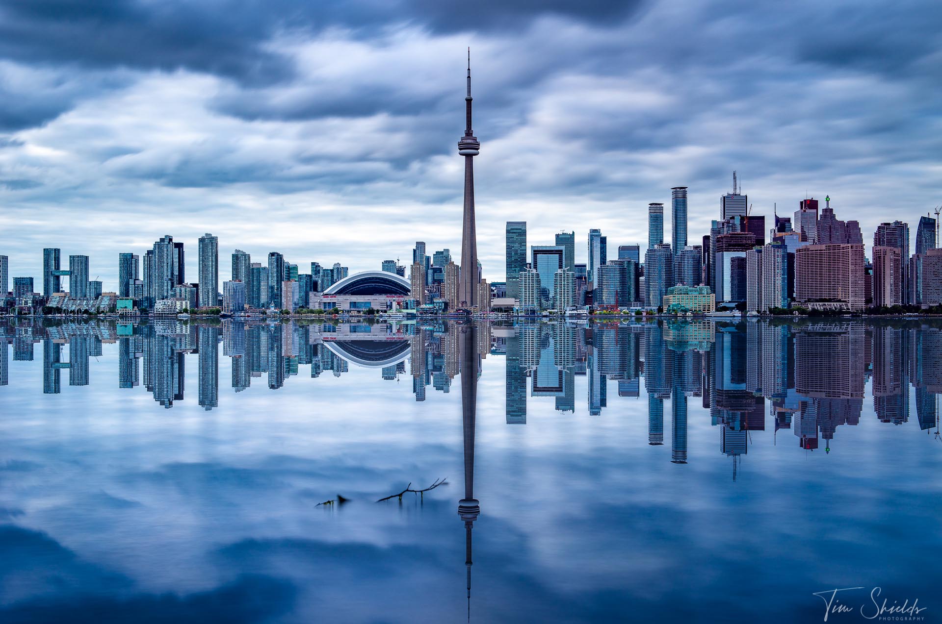
The other methods require the use of equipment. For example, blurring out waterfalls or clouds will require a long shutter speed, usually in the seconds. The longer the shutter speed, the smoother the moving pieces, the more they contrast with the sharp, still objects in a scene. But no matter how strong you are, you’re not going to be able to hold a camera perfectly still for 10 seconds. Instead, you’re going to need a tripod. With waterfalls, the blurry water brings the viewer’s attention to the sharp, detailed rocks around it. If it’s all sharp, a person might look at it for a couple seconds and walk to the next one. But the image with the blurry water will bring them closer to study why this one is so interesting.
Another way to create this interest is to have a blurry object in the foreground or background. If you’re photographing a flower, often you’ll get as close as your lens can focus to get the entire flower in the frame. If you use a wider aperture, like f2.8 or lower, the background will melt away leaving nothing but the bright, colorful flower to contrast with the green and brown background. Or, if you take a photo of a sweeping vista, you can shoot through the leaves and branches of nearby trees. Focusing on infinity with objects close in front of the lens will cause the foreground to become blurry, and add interest to the scene. All of the sudden, the viewer will feel like they’re standing where you are, looking through the same branches. This is a powerful contrast that is well sought after by photographers of all kinds.
Where can I learn more about composition and photography settings?
 If you want to learn exactly how to take photos like these every time, check out my Photography Cookbook. It’s a unique book filled with cheat sheets and recipes for getting the exact images that you’re looking for. I wrote this in the same way that a good chef will write out their recipes. This way, any photographer can take a look at a scene, and know exactly how to make the image that they’re looking for. I’ve used these exact settings over my career as +an award-winning landscape photographer. And I’m thrilled to be able to help new photographers around the world make their own world-class images.


